Color Palette

  • Problem

    Develop a design system for light and dark themes for an application that at the time had 200+ screens.

  • Tools

    Figma, Adobe After Effects

  • Year

    2020

  • My role

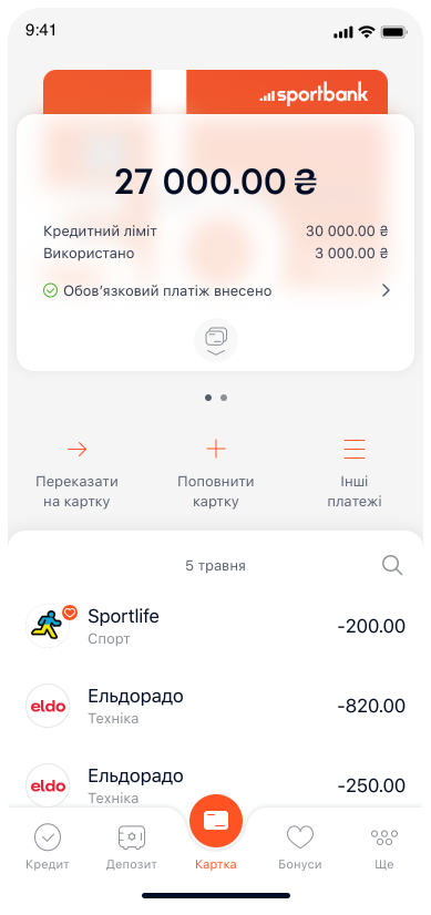
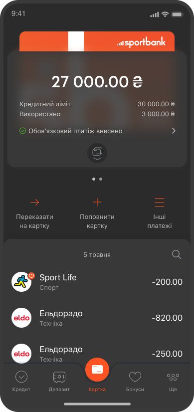
    Until this moment, there was no ready-made palette of colors. Creating a color system for both the light and dark themes was very important, because its presence makes the interface consistent, promotes efficiency in the development and maintenance of the application. Also, it was necessary to create a font system to ensure unity and ease of perception for users. My workflow included defining the structure of UI components, analyzing existing screens, improving them taking into account changes in the palette.

Main screen

Bonus section

Credit section

Savings account screen

Colors

  • So many!

    But the functionality of the application is not small. Each product has its own unique color and this doubled the palette.

  • Improvement

    In addition to creating new colors for the dark theme, I had to improve the palette for the light theme. It turned out that the application uses 50 shades of gray, which is not good, and the brand color did not match the brand. Everything was put in order πŸ™‚

  • Testing

    Since the theme was created when the application was already large, it was necessary to test the functionality of the colors for the dark theme on all existing screens, adjust the existing components and create tasks to update them. After all, earlier colors did not have corresponding names in the palette and were indicated only by hard code.

Icons .json

  • About 100 icons have changed

    Had to repaint. The new brand color changed from red to orange. The color of the main outline has been adapted to the background color of the dark theme (so that on a dark background it blends with the background, and on a light one it contrasts). The secondary outline color has been repainted to a contrasting gray for both color schemes.

  • Additional animation

    Many icons waited their time for animation to avoid further interventions. Well, their time has come, and the missing icons have been animated. Examples are given below. If you've read this far, hover over the icons to see how they look in a light theme πŸ™‚

icons

The result of the work

  • The most pleasant

    The result is an improved and consistent design for the application that improves the user experience and promotes efficiency in development and support. The development of the new design system was difficult, but it gave a significant increase in the functionality and visual appearance of the application.

  • Obsolete components

    Since the app already had a significant number of screens, testing the new theme was an important part of the workflow. Issues with components that already existed were identified and fixed.

After
Before