Registration

  • Problem

    On the basis of research, redesign the registration process to reduce the time of passing and eliminate errors during passing

  • Tools

    Figma, Adobe After Effects

  • Рік

    2023

  • My role

    UX design, research, interactive design, prototyping, usability testing, visual design, materials for animation

iPhone 14 Pro Mockup копия

Flow

The part of entering the number, which I propose to consider in more detail below, is one of the components of a large registration flow. After this stage, the flow is divided into 3 branches of the choice of providing documents for registration, through Diya or through photographing a passport or ID card. Next comes the filling out of the questionnaire and, based on the decision of the verifier, the further branch of identity confirmation is chosen, through a video call, a life selfie or through a photo with a document. Next, receiving a physical card and activating it or activating a virtual card.

All these processes were analyzed on the basis of research results and customer feedback. Each of the processes has been improved or redesigned completely, both in terms of logic and UI. Comprehensive work on improving the screens with the UX writer will also be carried out.

Problems

  • Lack of familiarity

    It is not possible to familiarize yourself with the application and products offered by the bank. It's good practice to give potential users some value on their first visit.

  • Unintelligible number entry

    The client enters an unregistered number to log in. Cannot paste a copied phone number. Does not display the cursor, but simply drops the numeric keypad. Without a cursor, it is impossible to change the position of the start of input, so if I made a mistake, I have no way to correct the error myself without resetting the system.

  • Code entry

    Low contrast code entry element. I received an SMS on viber and did not notify. Didn't understand where the SMS came from?

  • Call order

    It is not clear what numbers to enter. Often the 4 digits of the calling number are given.

  • List of actions after entering the number

    Firstly, this description does not cover all branches of registration, and secondly, it does not include any information. What documents, what data, etc.?

Number entry

Step 1

Step 2

Guide

The solution

  • Registration and login

    We divide the flow into 2 branches - registration and login. If the client wants to log in using a number that is not registered, it will be clear to him what to do next. Added a page slider for new users to get to know the bank.

  • Entering the number is made clear

    For the input field, we use a basic element that is intuitive to the user. We add a phone number mask to simplify input. Thanks to this decision, all the functionality that was commented on appears (changing the position of the cursor, inserting a phone number, completely clearing the field, etc.)

  • Code entry

    We use standard input fields as on the previous screen. In priority, we use SMS messages, this will almost eliminate the risk of a lack of notification, as well as provide the possibility of auto-substitution of the code.

  • Call order

    We write the necessary action in the title. We add a standard animation that illustrates the call request process.

  • List of actions after entering the number

    We remove the screen that does not perform any function for the user

Welcome Guide

Step 1

Step 2

If the code has not arrived

As a result of the work, a flow was created with the prediction of all possible errors and user cases with posts. In order to find out all possible options for the development of the user’s path, close cooperation was established with the customer support department, lawyers, and developers.

After the implementation, the indicators of positive evaluation of the customers from the process during testing increased by 53%, and comments and misunderstandings disappeared. All test clients who started the registration process without problems were able to proceed to the next stage 🥳

Photo

  • Design

    Many comments regarding the contrast of tooltips, masks, comprehensibility of icons, etc. have been worked out.

  • Understanding

    Client pain associated with dry legal terms will be reduced due to cooperation with a UX writer. The texts have become clear and a little friendly 😊

  • Logic

    As a result of cooperation with the department of verifiers, lawyers and developers, processes that need to be improved were identified. For example, it was possible to set up automatic recognition of the identification code on the ID card, so as not to ask the client if it is indicated there. The auto-photo process was adjusted to avoid incorrect pictures that were often taken by customers.

Questionnaire

  • Design

    The elements of the input fields have changed according to the Material Design guides, because the fields and drop-down lists that were used before were custom, did not work correctly, and were intuitively incomprehensible to users.

  • Understanding

    In cooperation with a UX writer and lawyers, the names of complex banking issues, which always caused confusion among clients, were simplified. Almost all items of the questionnaire were rewritten.

  • Logic

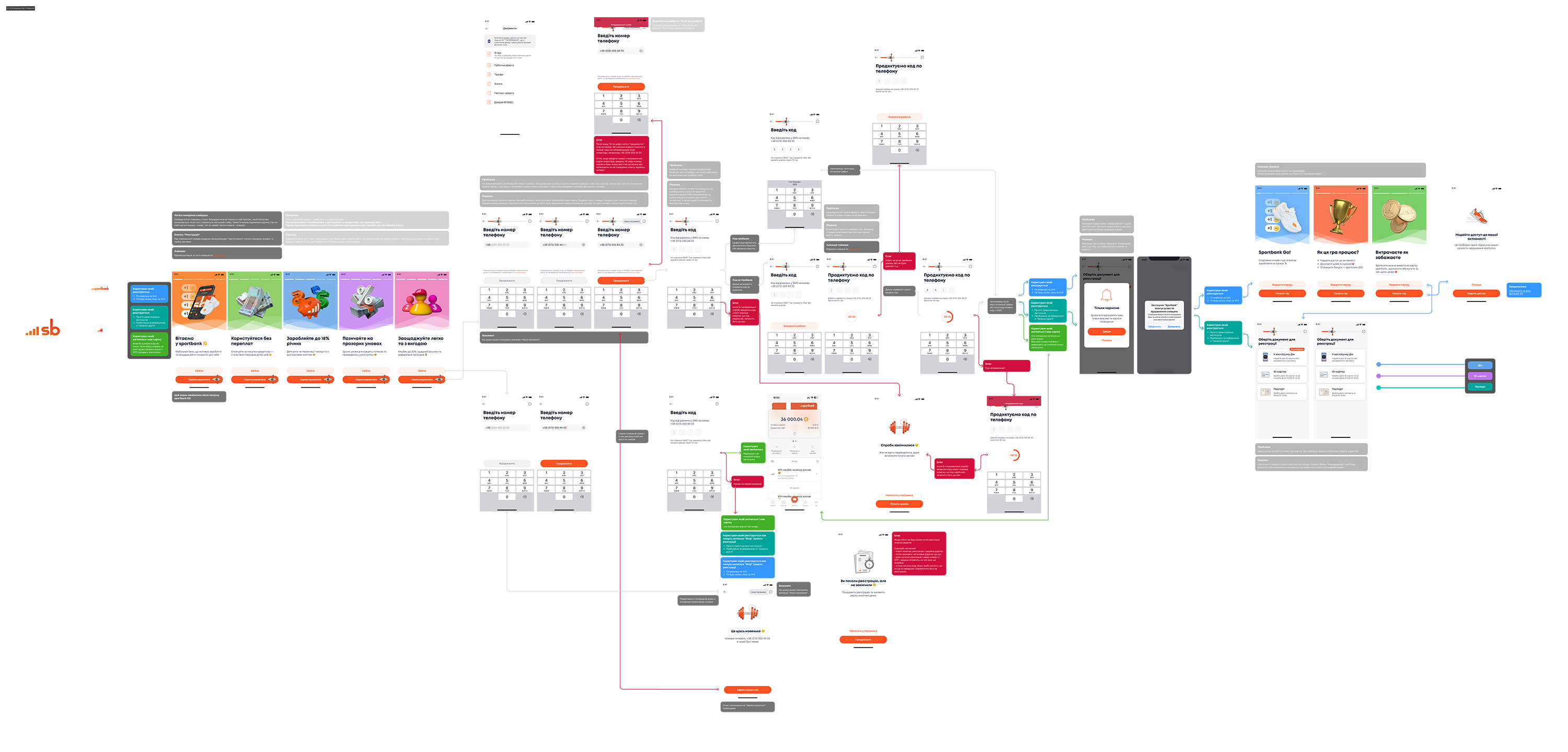
    Talking with the verifiers and lawyers, I found out that it is possible to remove some fields from the questionnaire, so as not to burden the user with them, because we can receive this information automatically, as a result of a request to state structures. I also decided to divide the questionnaire into 3 groups according to the type of questions (Income, Employment, Personal data), because previously all these questions were on one screen, which greatly burdened the user. There has also been a tremendous amount of work done on little things like tooltips, allowing you to choose from options instead of manually filling in others.

Other

Work on this section was carried out comprehensively, therefore it is impossible to divide it into pieces, but as in the cases above, work will be carried out on texts, visuals and logic. The biggest part of the work was to identify all possible errors and reasons for failures, the logic of redirecting the client under one or another scenario, the stages at which data checks are performed and the search for opportunities to reduce the client’s wait for the result.

But as a result of the work, a high-quality system was created that allows you to track all these ways. The number of screens for waiting and checking documents was reduced from 5 to 2, and the speed of their processing was reduced by 2 times due to the establishment of parallel processes.

The result

  • It became clearer

    The test group had 80% fewer comments and questions about the registration process.

  • It became faster

    The number of waiting screens and checks was reduced from 8 to 4, and the speed of their processing was reduced by 2 times due to the adjustment of parallel processes. Due to the automation of processes, it was possible to eliminate as many as 4 screens from the flow. It was possible to remove 20% of the fields to be filled from the questionnaire by setting up automatic information retrieval. Registration speed increased by 34%

  • Easier to implement

    Ресурс розробників це також важлива складова. За рахунок зрозумілого опису по схемі з усіма посиланнями та кейсами розробникам було зручно з цим працювати а опис за процесом був добре зрозумілим всім учасникам процесу.

  • Pleasure

    Nothing is more gratifying than a good work result with positive indicators of process improvements. A lot of work was done, which bore fruit and received a positive evaluation from the test group of users 🥳